How to Prompt an AI Builder into a Website You Would Actually Ship: 10 Questions
The 10 Questions That Write Your Prompt For You
Everyone has had the same experience with an AI website builder. You type a sentence, you get something that looks like every other generated site, and you spend the next hour prompting it back toward what you meant. The tool is not the problem. A one-sentence brief is.
A good prompt is not longer for the sake of it — it is a brief. The difference between a generic result and a site you would actually show a client is roughly ten decisions, made before you type anything. Answer these ten questions, paste your answers together, and you have the prompt.
At the end of this article there is a complete worked example you can copy and adapt.
Rather not answer the ten questions yourself? The Website Prompt Generator asks them for you and writes the complete prompt — and it can start from your current website.
1. What kind of site is this, and who is it for?
Ask yourself: What does this site have to do, and who has to be convinced by it?
Every generated site drifts toward a generic template unless you name the category. "A website" gets you a template. "A marketing site for a B2B SaaS company" gets you the right information architecture: solutions pages, pricing tiers, a demo request, social proof.
2. Which existing site should it be structurally modelled on?
Ask yourself: Whose structure already solves this problem well?
This is the highest-leverage sentence in the whole prompt. Naming a reference site imports decades of layout decisions in five words. Be explicit that you mean structure, not looks, or the model will copy the colours too.
3. How should it look, and what should it not look like?
Ask yourself: What is the visual identity, stated as a contrast?
Describing an aesthetic in the positive is vague; describing it against something is precise. "Dark and precise" is interpretable. "Dark and precise instead of bright orange-on-white" is not.
4. What is the exact tech stack — and what is forbidden?
Ask yourself: What must it be built with, and what must it never use?
The constraint that matters most is the negative one. Most AI builders default to Next.js with server components, which is the single most common reason a generated site cannot be converted into a CMS theme later. Say no explicitly.
5. What are the exact design tokens?
Ask yourself: What are the literal hex values, fonts and sizes?
This is where most prompts collapse into "modern and clean". Give a real palette with hex codes, a type scale with pixel values, a spacing unit and a radius scale. A named token table is the difference between a design system and a mood.
6. Where is the accent colour allowed to appear?
Ask yourself: Which rules govern the design, not just its values?
Tokens tell the model what exists. Rules tell it what restraint looks like. Without a rule, a bright accent ends up as a full-bleed background section and the enterprise feel evaporates.
7. Which components does the site need?
Ask yourself: What is the actual component inventory?
Listing components turns one vague request into a checklist the model can work through. It also stops you discovering three pages in that there is no testimonial card and no pricing table.
8. Which pages and routes exist?
Ask yourself: What is the sitemap, route by route?
Name every route, including the detail templates people forget: a blog listing without a blog detail page is a dead end, and it is the omission that shows up most often in generated sites.
9. Should the pages be finished, or scaffolded?
Ask yourself: How complete does the content have to be?
Unless you say otherwise you will get lorem ipsum and empty states. Ask for plausible copy on every page and every template, and you get something you can actually show to a stakeholder.
10. What has to be true about quality?
Ask yourself: What are the non-negotiables you would otherwise have to fix by hand?
Accessibility, responsiveness and file structure are cheap to request up front and expensive to retrofit. Ask for them in the same breath as the design.
Putting it together
Ten answers, in order, are the prompt. Nothing here is clever — it is just specific. The model is not guessing what you meant by "modern", because you told it #22262A.
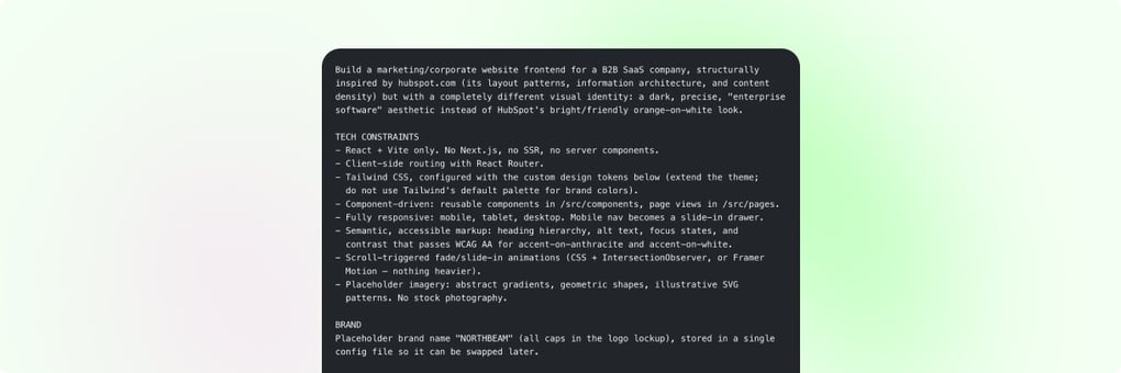
Here is the full worked example, assembled from the answers above:
Build a marketing/corporate website frontend for a B2B SaaS company, structurally
inspired by hubspot.com (its layout patterns, information architecture, and content
density) but with a completely different visual identity: a dark, precise, "enterprise
software" aesthetic instead of HubSpot's bright/friendly orange-on-white look.

TECH CONSTRAINTS
- React + Vite only. No Next.js, no SSR, no server components.
- Client-side routing with React Router.
- Tailwind CSS, configured with the custom design tokens below (extend the theme;
  do not use Tailwind's default palette for brand colors).
- Component-driven: reusable components in /src/components, page views in /src/pages.
- Fully responsive: mobile, tablet, desktop. Mobile nav becomes a slide-in drawer.
- Semantic, accessible markup: heading hierarchy, alt text, focus states, and
  contrast that passes WCAG AA for accent-on-anthracite and accent-on-white.
- Scroll-triggered fade/slide-in animations (CSS + IntersectionObserver, or Framer
  Motion — nothing heavier).
- Placeholder imagery: abstract gradients, geometric shapes, illustrative SVG
  patterns. No stock photography.

BRAND
Placeholder brand name "NORTHBEAM" (all caps in the logo lockup), stored in a single
config file so it can be swapped later.

COLOR TOKENS
--color-white              #FFFFFF   primary/light backgrounds
--color-off-white          #F5F6F7   secondary background, cards on light
--color-anthracite         #22262A   primary dark background
--color-anthracite-2       #2C3136   elevated surface on dark
--color-dark-gray          #3F454B   borders/dividers on dark
--color-text-primary       #1A1D20   body text on light
--color-text-secondary     #6B7280   muted text on light
--color-text-inverse       #F5F6F7   body text on dark
--color-text-inverse-muted #9CA3AF   muted text on dark
--color-accent             #D6FF3F   electric lime: CTAs, highlights, active states
--color-accent-hover       #C2EB2C   accent hover/pressed
--color-accent-contrast    #1A1D20   text ON the accent (never white)
--color-border             #E5E7EB   borders on light
--color-success            #3FCE7E   positive status
--color-danger             #FF5C5C   errors

DESIGN RULE: the accent is used sparingly — primary CTAs, small badges, underline
bars, active nav indicator, key stat numbers, chart accents. Never a large background
fill. It stays a spark, not a wash.

TYPOGRAPHY (load via Google Fonts)
- Headings: Space Grotesk 500/600/700
- Body/UI: Inter 400/500/600
- Monospace: JetBrains Mono 400/500 for code, data labels, tags
Type scale (desktop / mobile, fluid clamp() where sensible):
H1 56/40 Space Grotesk 600, -0.02em, line-height 1.05
H2 40/30 Space Grotesk 600, line-height 1.1
H3 28/22 Space Grotesk 500
H4 20/18 Space Grotesk 500
Body Large 18 Inter 400/1.6 - Body 16 Inter 400/1.6 - Small 14 Inter 500
Eyebrow 13 Inter 600 uppercase, 0.08em, often in the accent

SPACING & LAYOUT
8px base unit. Section padding 96px desktop / 56px mobile. Max width 1280px centered,
24px gutter mobile / 64px desktop. 12-column grid collapsing to 1-2 columns.
Radius: 8px buttons/inputs, 16px cards, 24px large panels. Shadows subtle
(0 1px 2px rgba(0,0,0,0.04), 0 4px 12px rgba(0,0,0,0.06)); cards on anthracite use a
1px --color-dark-gray border instead of a shadow.

COMPONENTS
Navbar (sticky, transparent over hero, solid white on scroll, mega-menu dropdowns for
Product / Solutions / Resources / Pricing, "Log in" text link + "Request a demo"
accent button) - Buttons (primary accent, secondary ghost on light and dark, text link
with arrow) - Hero (dark, H1 + subhead, two CTAs, abstract visual, trusted-by strip) -
Logo strip - Feature grid and alternating image/text blocks - Stats band (large accent
numbers on dark) - Product tabs/showcase - Testimonial cards - Pricing (3 tiers, middle
highlighted "Most popular") - Resource/blog cards (image, mono accent category tag,
title, date) - CTA band - Footer (multi-column links, newsletter input, social, legal
bar) - Badge/tag in mono.

PAGES / ROUTES (all sharing one layout with Navbar + Footer)
/                 Home: hero, logo strip, feature grid, product tabs, stats,
                  testimonials, CTA band
/product          Product overview, feature deep-dives
/solutions        Solutions by industry/team, card grid
/pricing          Three tiers + FAQ accordion
/resources        Blog/resource listing grid with filter tags
/resources/:slug  Blog DETAIL template: title, category tag, date, author, hero image,
                  long-form article body (headings, paragraphs, lists, pull quote,
                  inline image, code block), and a "related articles" row
/about            Mission, leadership grid, timeline/stats
/demo-request     Form page with validation states using success/danger tokens

CONTENT COMPLETENESS
Fill every page with real content — no lorem ipsum, no empty states, no "coming soon".
Write plausible, concise enterprise SaaS copy: short headlines, benefit-driven
subheads. Populate the resource listing with at least 6 article cards, and write at
least 3 complete blog detail pages so /resources/:slug is genuinely browsable.

DELIVERABLES
Clean componentized code. tailwind.config.js centralizing every token above.
src/config/brand.js holding brand name, tagline and nav links. Prioritize Home,
Product and Pricing for full visual polish; other pages reuse the same components.
The two things almost everyone forgets
Two of the ten questions above exist because their absence is the most common flaw in generated sites, and both are one sentence to fix.
- The blog detail page. Prompts routinely ask for a blog listing and stop there. You get a grid of cards that link nowhere. Ask for the
/resources/:slugtemplate explicitly, and describe what an article page contains. - Finished content. Unless you ask, you get placeholder text and empty states. "Fill every page with real content, no lorem ipsum" costs nine words and turns a scaffold into something presentable.
One constraint that decides what happens next
Question 4 is worth a second look, because it is the only answer with consequences beyond the design. React + Vite, no SSR, no server components.
Most AI builders default to Next.js with the App Router. That is fine while the project lives in the builder — and it is the single most common reason a generated site cannot be converted into a WordPress or HubSpot theme afterwards. WordPress renders PHP; HubSpot renders HubL on its own servers. Neither has a Node runtime waiting to execute your server layer.
Stating the constraint in the prompt costs nothing. Discovering it after the design is approved costs a refactor.
From prompt to a site someone else can edit
A great prompt gets you a great frontend. It does not get you a CMS — the marketing team still cannot change a headline without a developer and a deploy.
That is the step transjt handles: push the generated code to GitHub, connect the repository, and the React frontend becomes a native WordPress theme with real PHP templates, or native HubSpot modules with editable fields. Prompt well, then convert, and the site is both yours and operable.